UI Kit & design ops at Nurole
Outcomes & benefits
-
More consistency across our tools
Having 4 different platforms for different purposes (Marketing website, Client portal, Member app, internal admin) requires a lot of structure and consistency as well as enough differentiation to understand which part of the journey you are in. Our UI Kit helped us a lot navigate these challenges.
-
Better efficiencies while building
Being able to reuse existing code and have a well-defined design language made collaboration much easier and more streamlined. We were able to create design super fast and then iterate on them with the team (either PM or engineers).
-
Improved alignment with engineering
Thanks to the devmode, there was less needs for design’s input on all states and screen sizes. It was already defined in the UI Kit and that was super helpful for the dev team. The interactive components also helped us explain our ideas through prototyping.
I joined Nurole as the founding designer therefore I had a blank canvas and put everything in place.
That means: creating a digital colour palette, a UI kit, a documentation system, Figma ops systems, etc.
You can learn more about my experience at Nurole here.
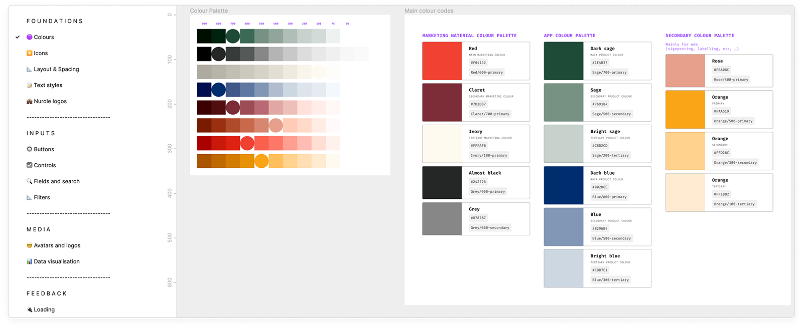
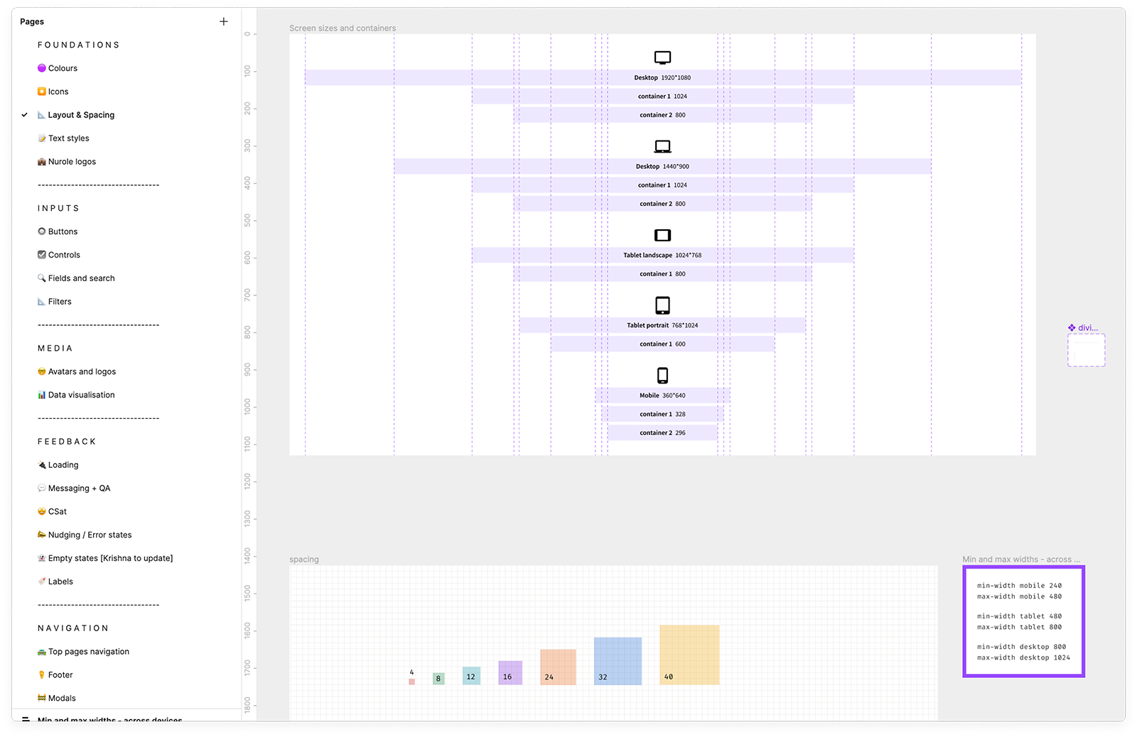
Digital colour palette & branding
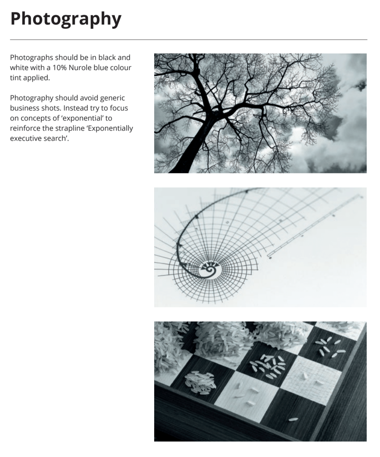
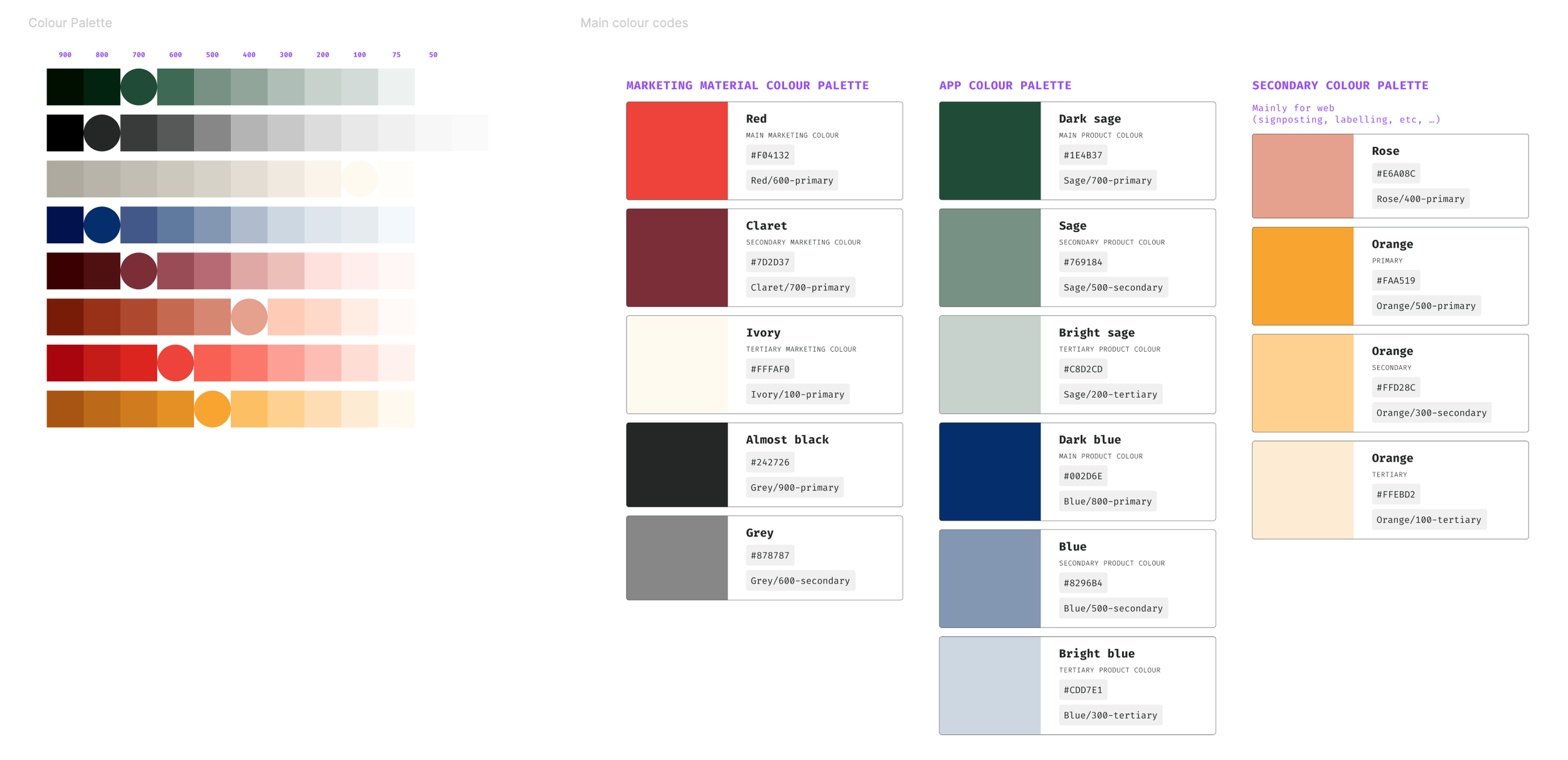
When I joined there was only a small .pdf with 4 colours, 1 Google Font and Black and white photography. None of it was thought for digital content or for accessibility.
There was nothing more than this teal colour to create highlights and contrast so it was incredibly limiting and didn’t work on white backgrounds as it wasn’t passing accessibility scores.
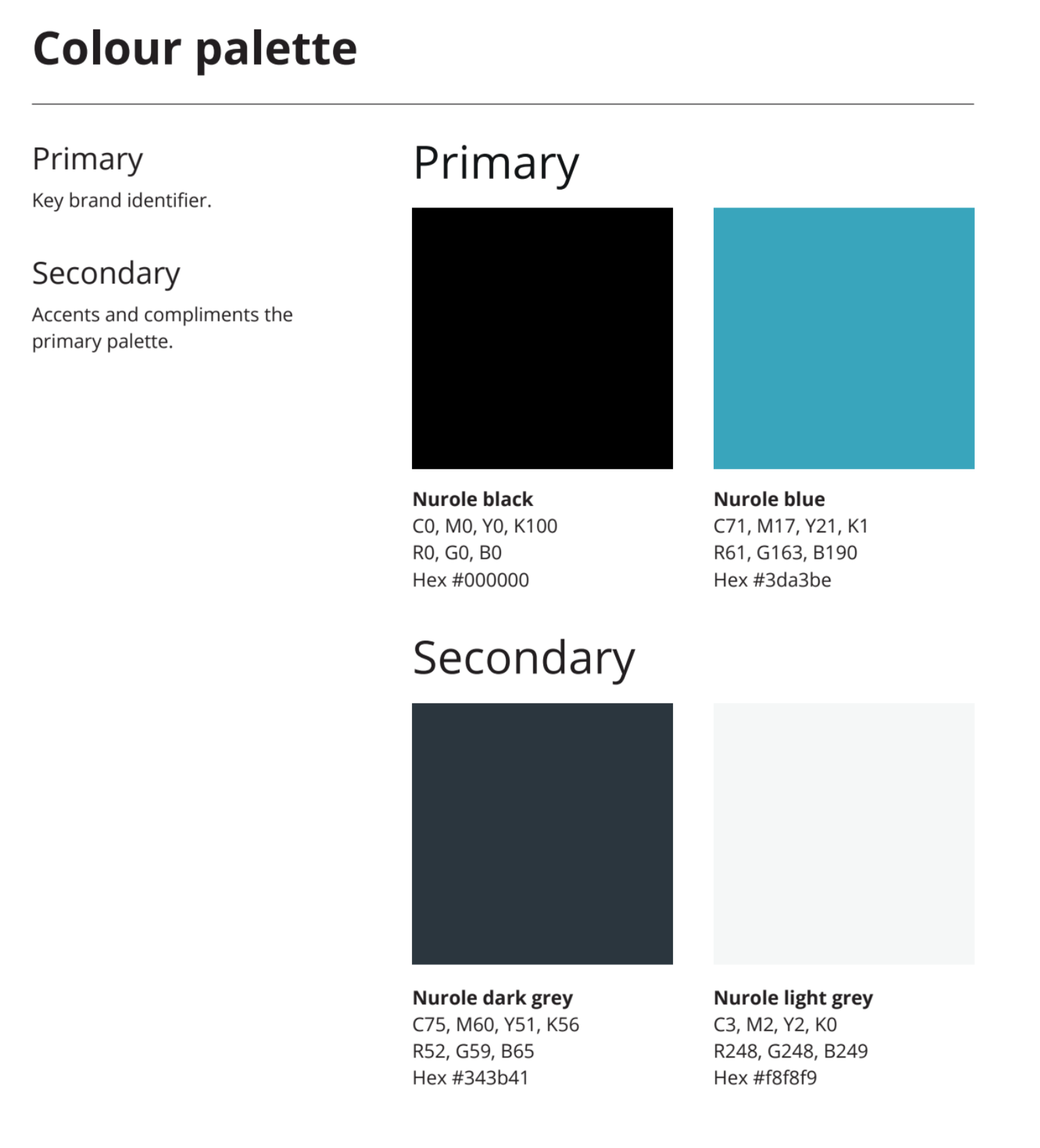
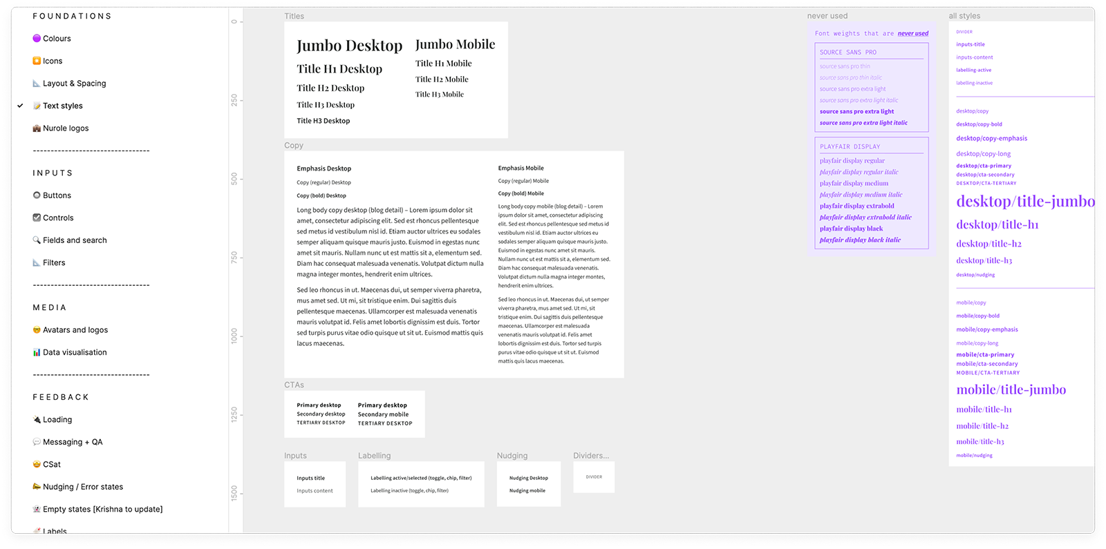
So after the rebranding in July 2021 I created a full digital colour palette as well as font scale and spacing rules to build the full UI kit from.
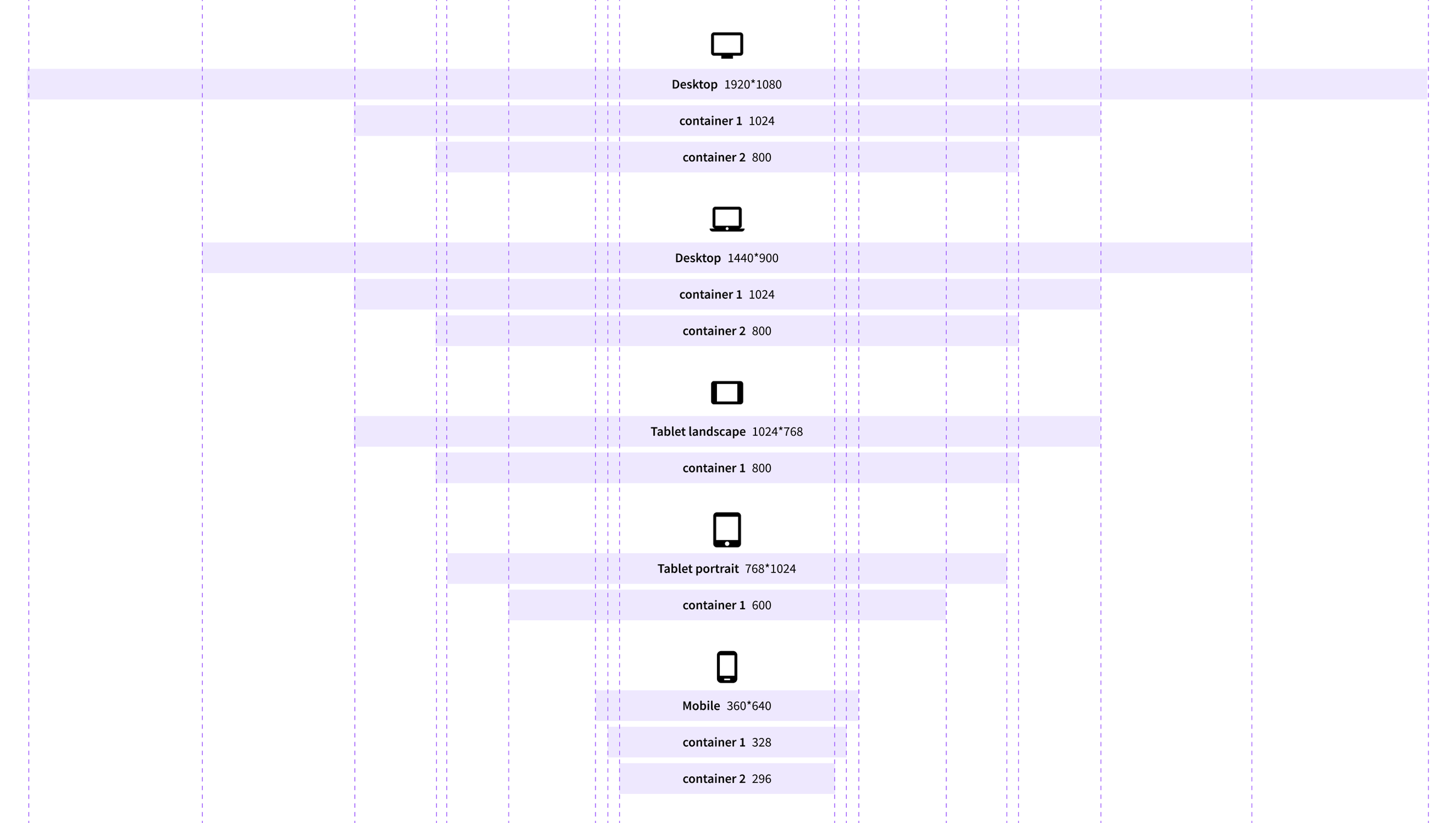
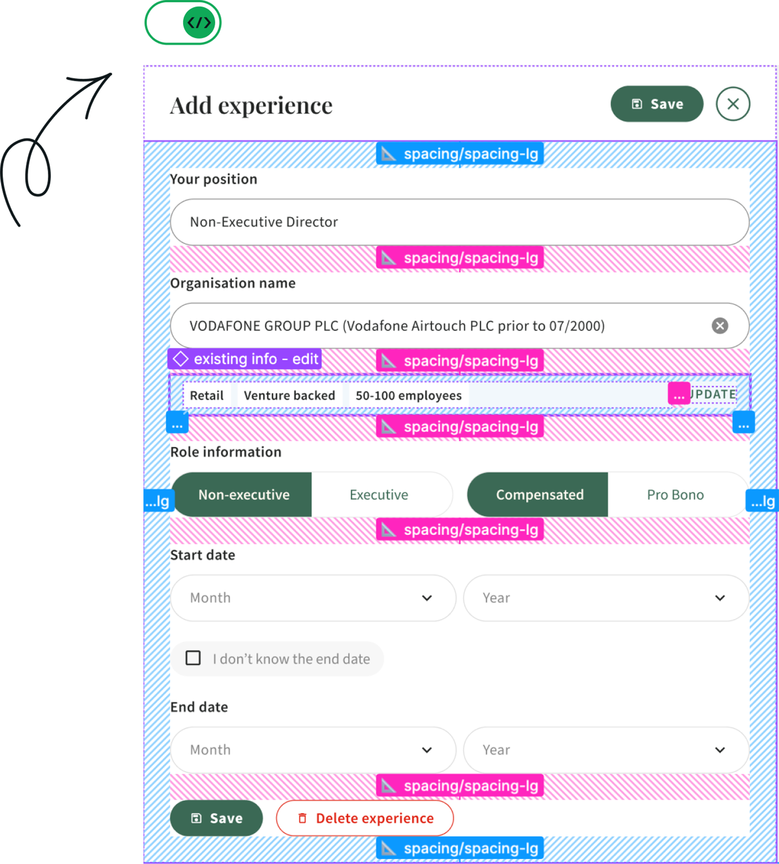
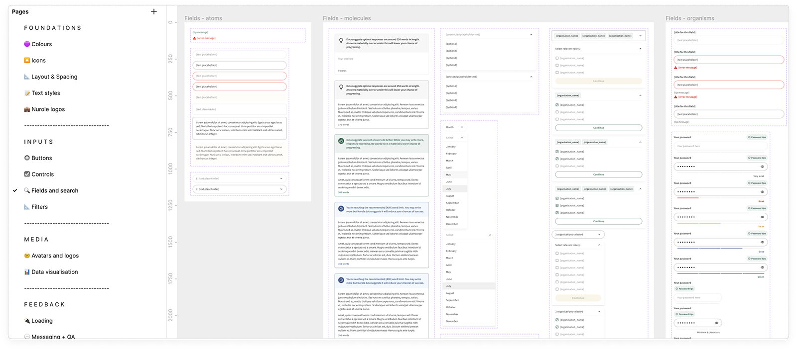
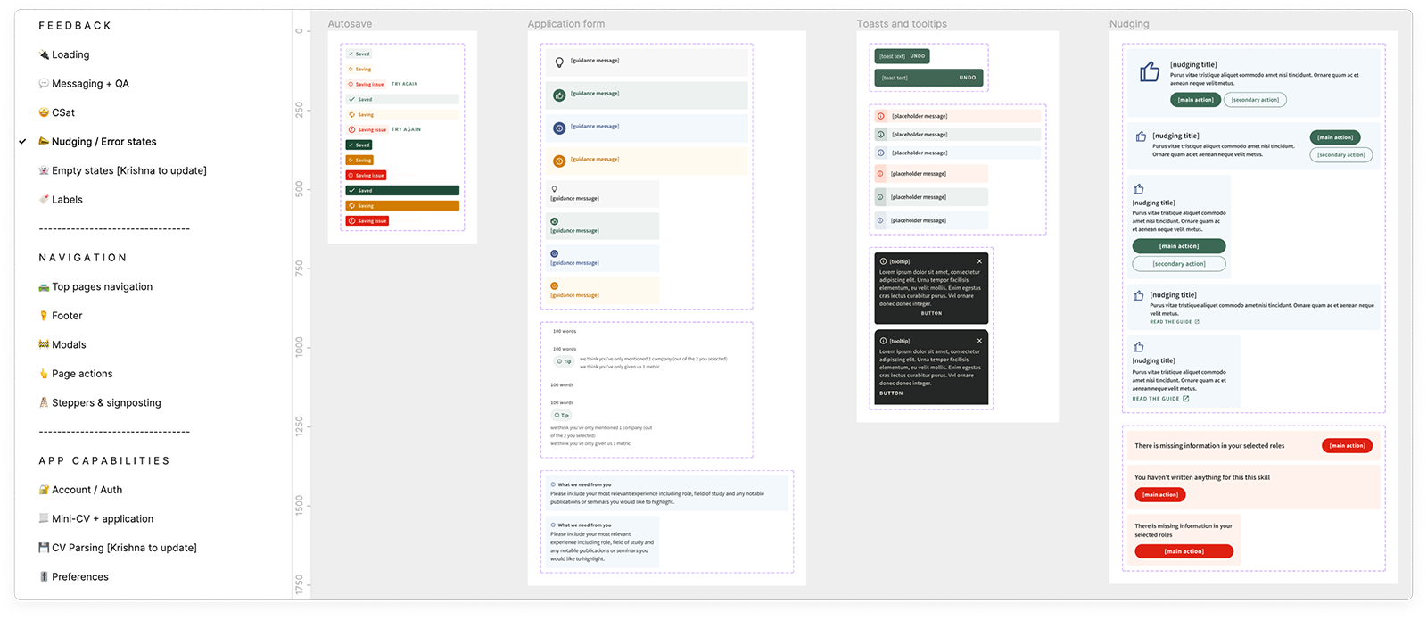
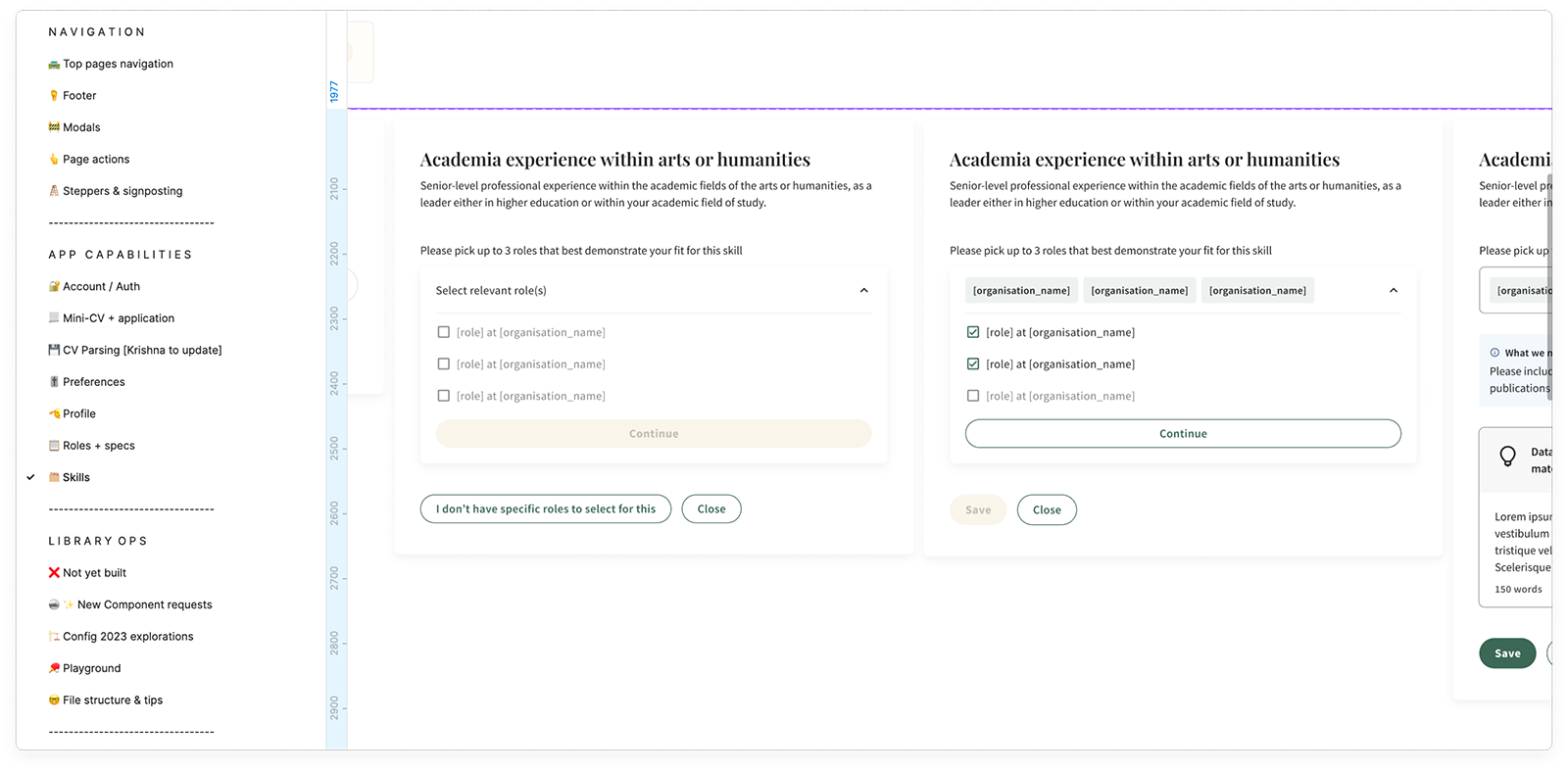
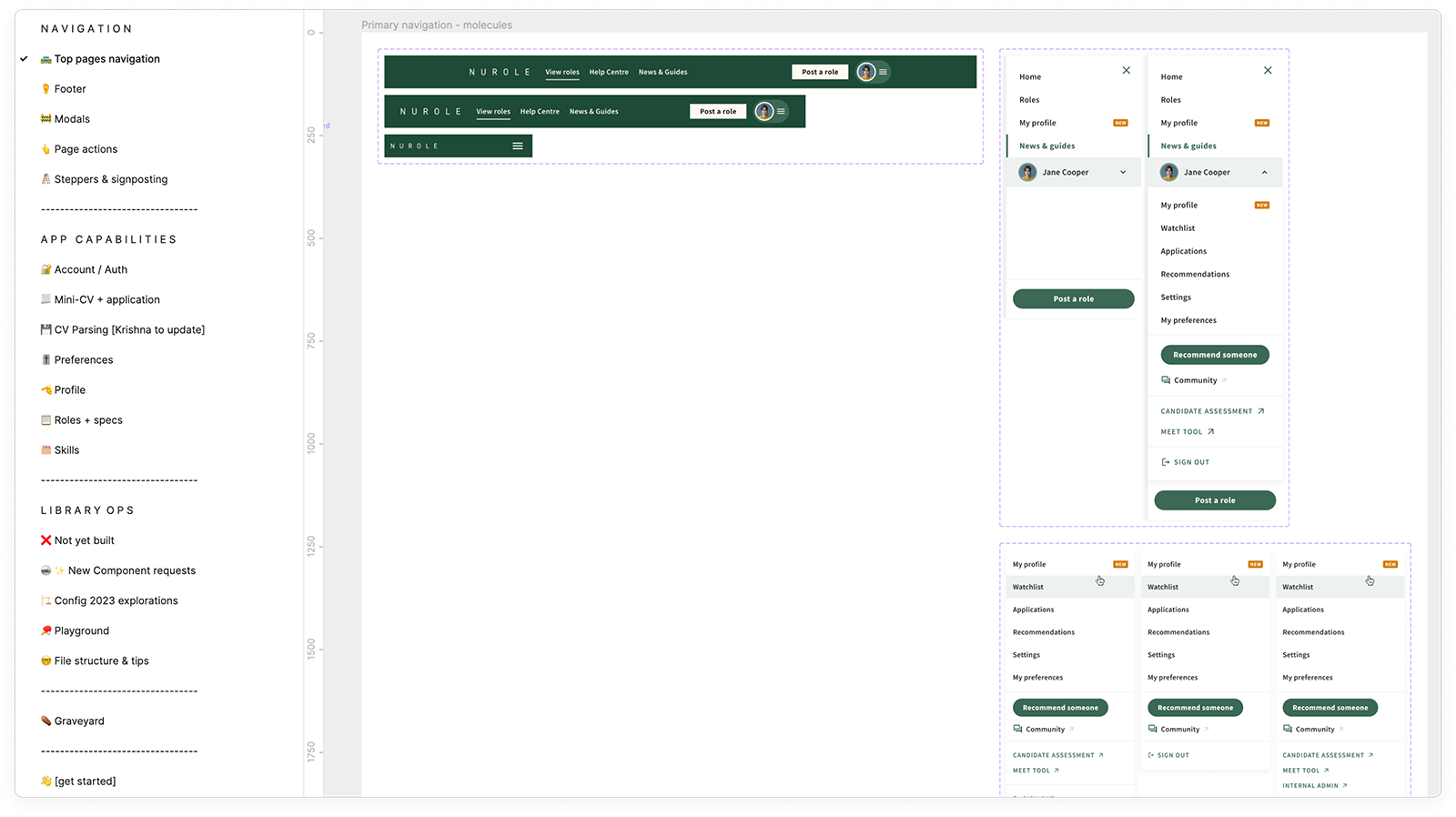
Full Design UI Kit library
This is one of the many components I created, one of the most reused ones since it is part of different repositories and tools.
It has also evolved a lot since day 1 following-up from team iterations, product evolution and functionalites being added to it.
The addition of new Figma features since I created the first version also brought new changes in the component’s structure: variants, absolute position etc.
-
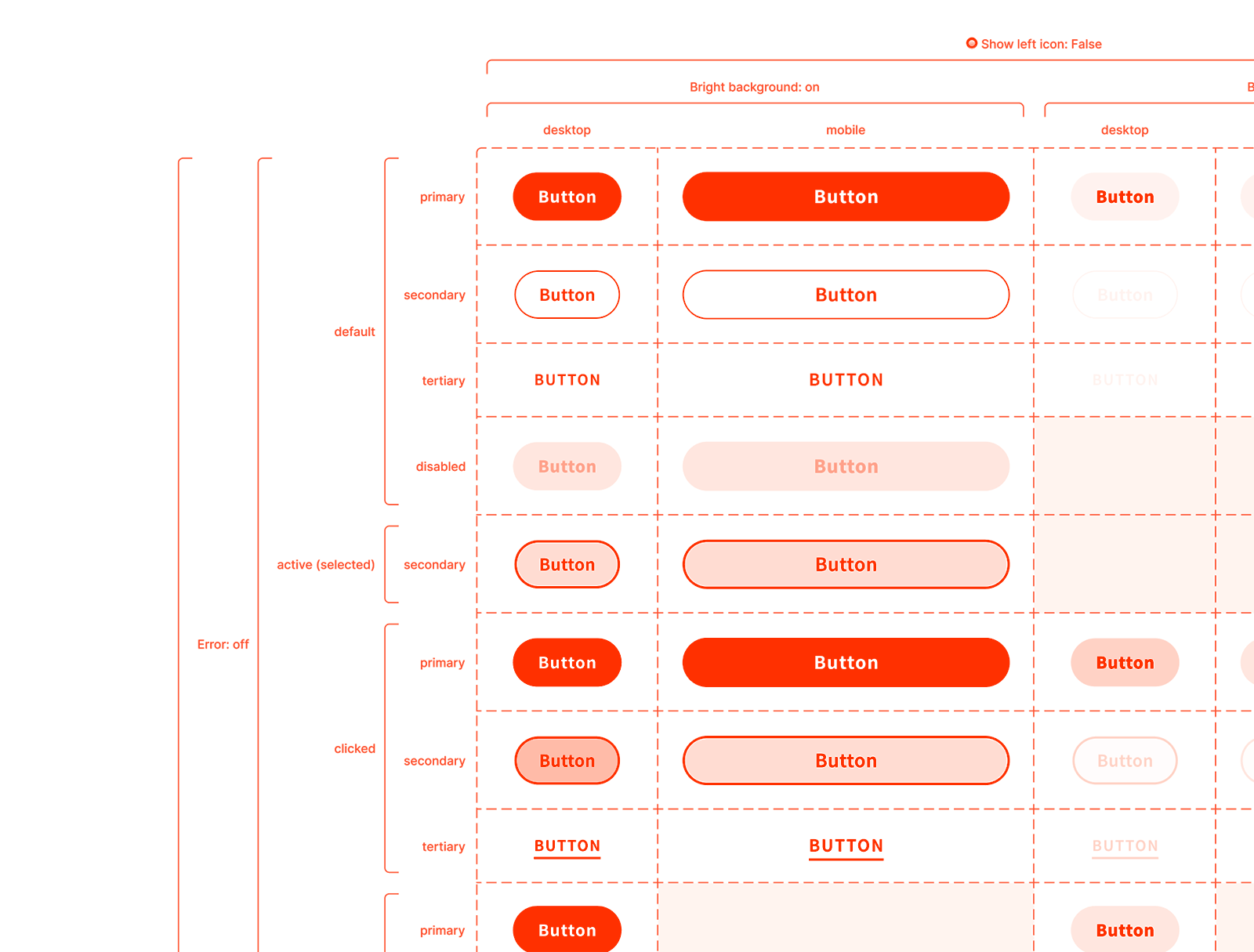
Atomic Design Principles
I put atomic design principles in place since day 1 in order to be able to be as efficient as possible in creating the UI Kit. That is how I managed to be super fast in creating new designs for the development team to build quickly as well, reusing a lot of existing code that they had built previously.
-
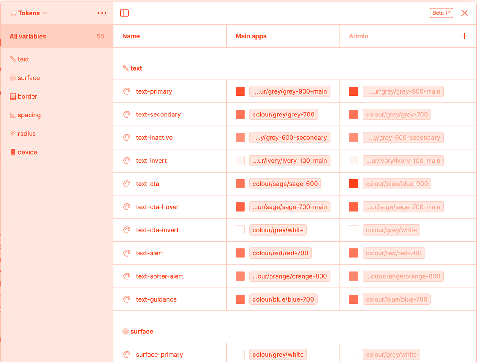
From styles to tokens
Following the new updates from Figma in the summer 2023 I started to implement tokens to replace styles in our style guide. That motivated our developers to implement them in the code base and finally have tokens across all our tools. It helped us with consistency and efficiencies as well.
-
Optimisation and consistency
Having a UI kit was super helpful for our team to be able to have consistency across all our tools and in our design language. It really helped us communicate with developers and iterate on our designs easily without having to go back to wireframes for every new project.
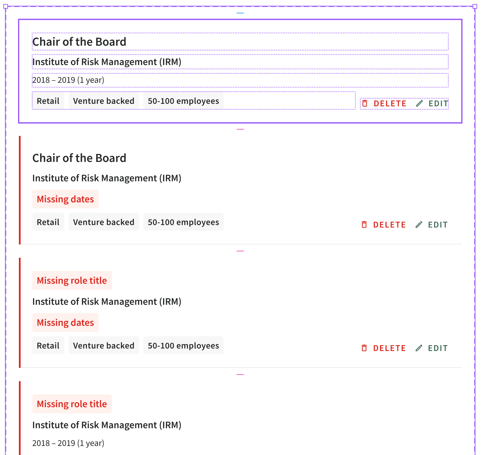
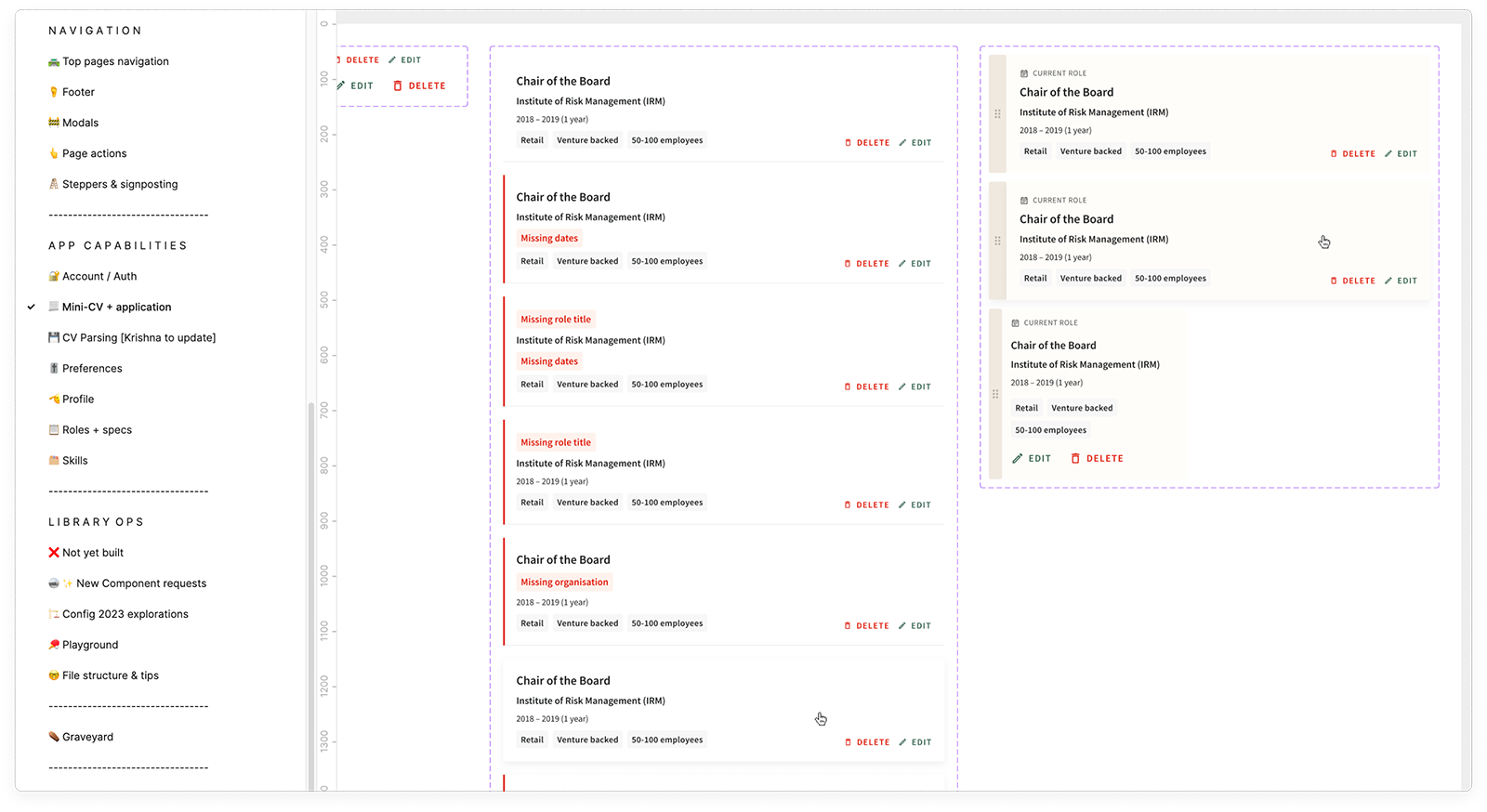
“We have so many different versions of the modal, we need to create a component!”
Our most recent and updated component
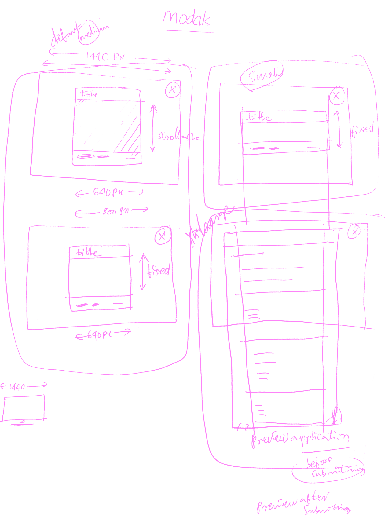
We soon started to identify the main use cases for all our modals, with different interactions and functionality for each type.
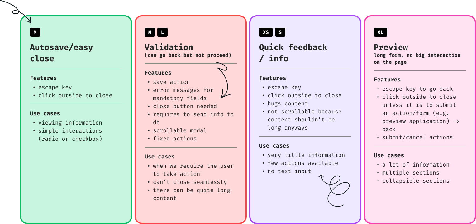
After having identified the use cases I started to create the high fidelity design with different scenarios and screen sizes.
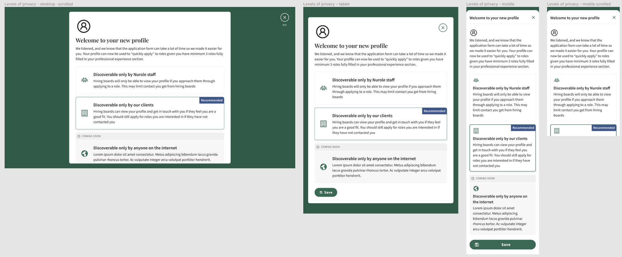
Thanks to the devmode, we were able to communicate so much more easily between design and engineering. It was a huge improvement for our teams efficiencies and ways of working.
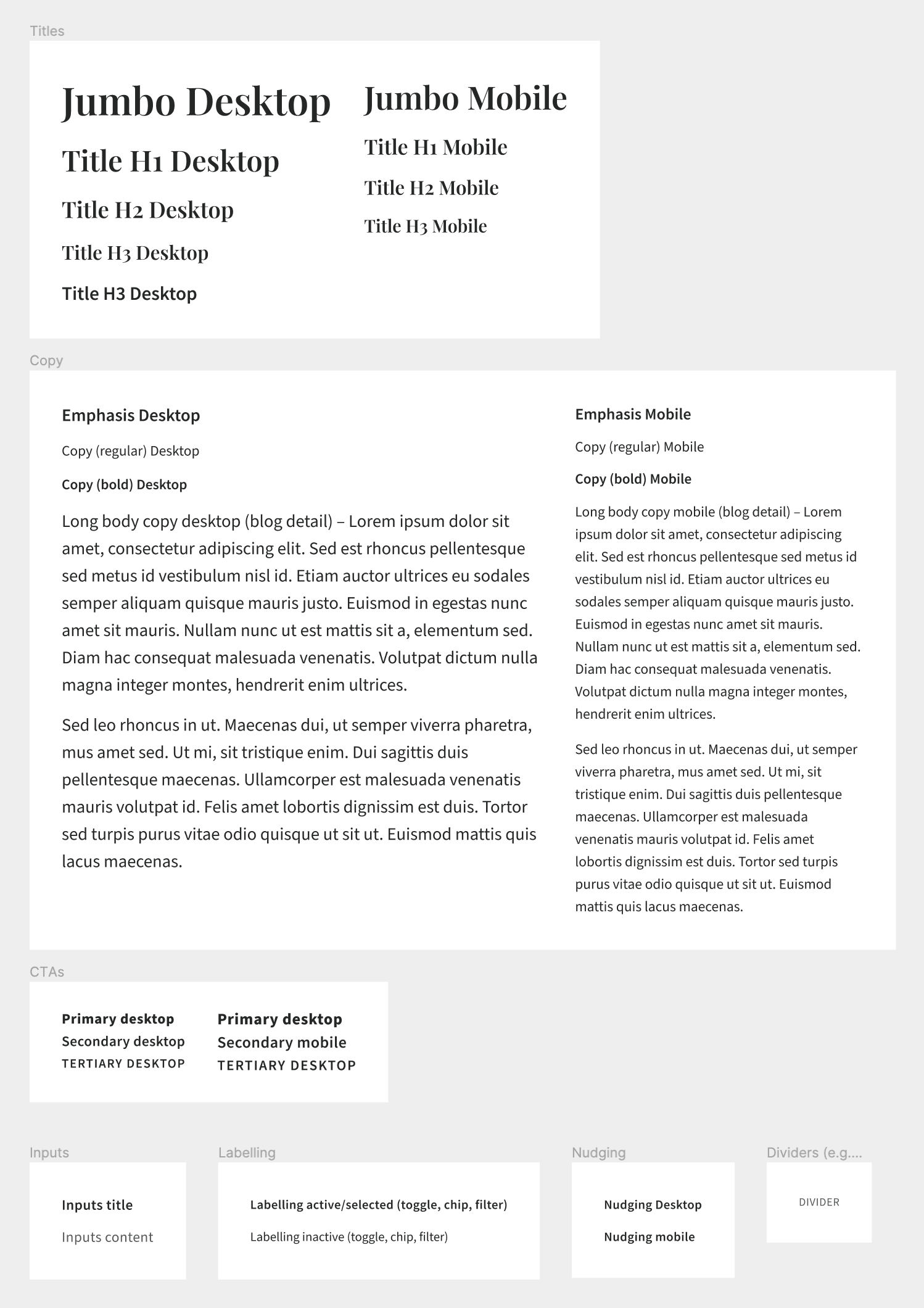
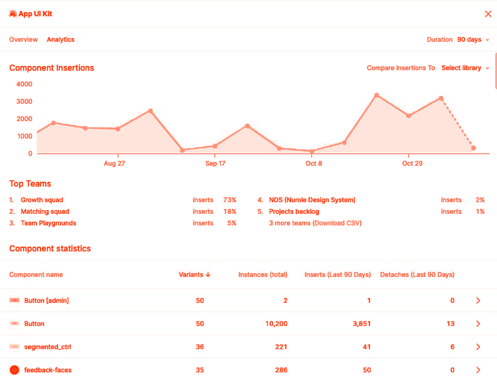
Overview of my main UI Kit library
Design ops
Design ops
Since Day one at Nurole I worked as if I had a team so that our function would be future proof and work efficiently.
As time went and when I grew my team, we worked on many iterations of the covers and design file documentation.
That allowed for more consistency and clarity for the team to know where to find information about the project as well as understand what state each project was in.
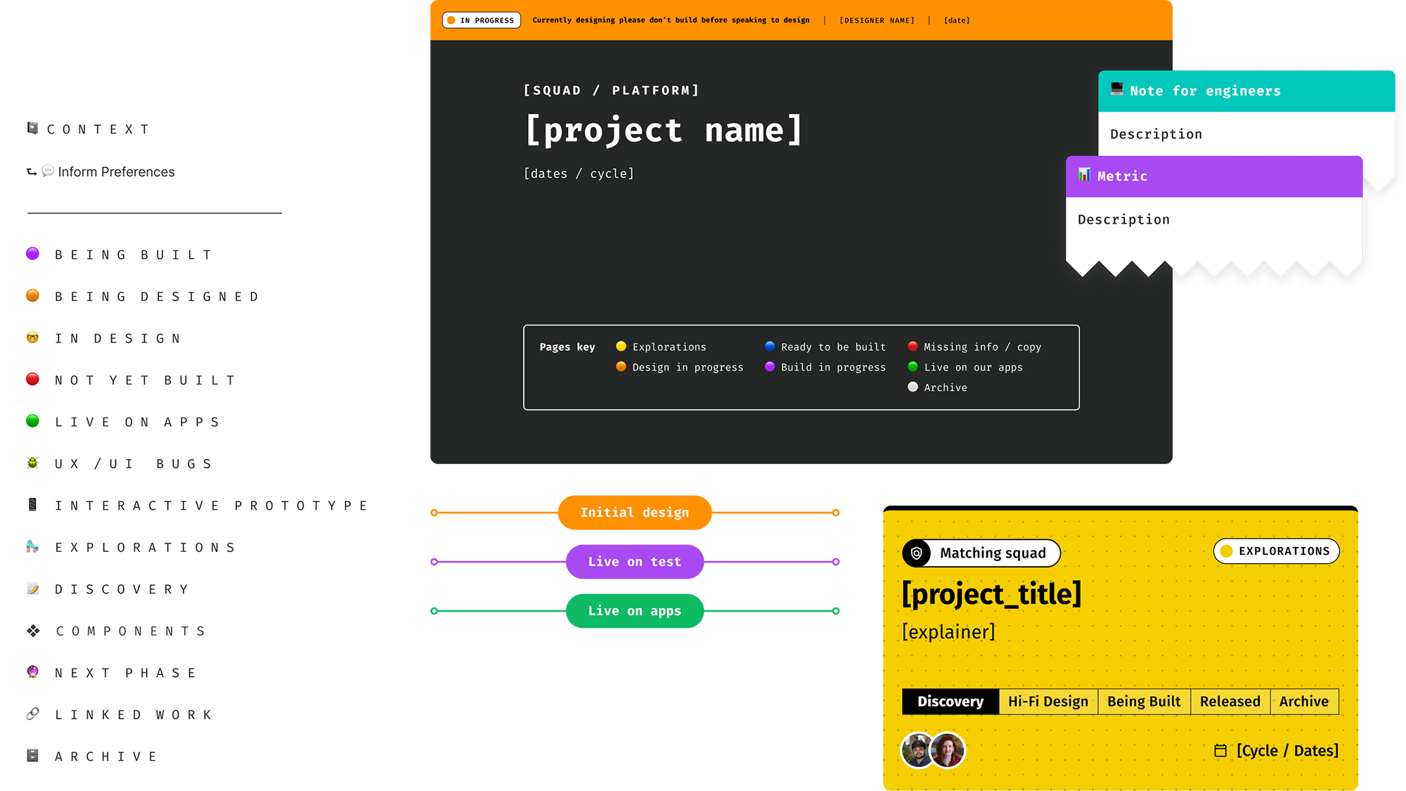
At Nurole I built a full Notion wiki for our team with the same purpose: futureproof our function within the business.
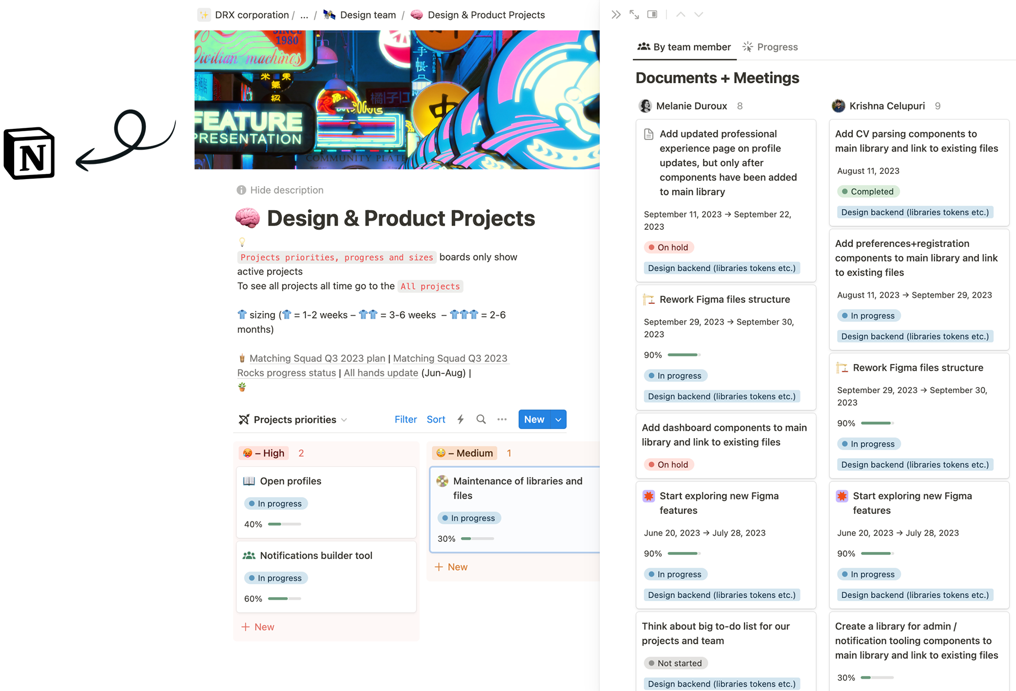
Our project tracker was super helpful for us to list all project steps, documentation, meetings, feedback, etc.
It also helped us during our weekly team meetings where we would make sure we were aligned on priorities and progress.
More about my role as Founding Lead designer at Nurole