Candidate assessment tooling
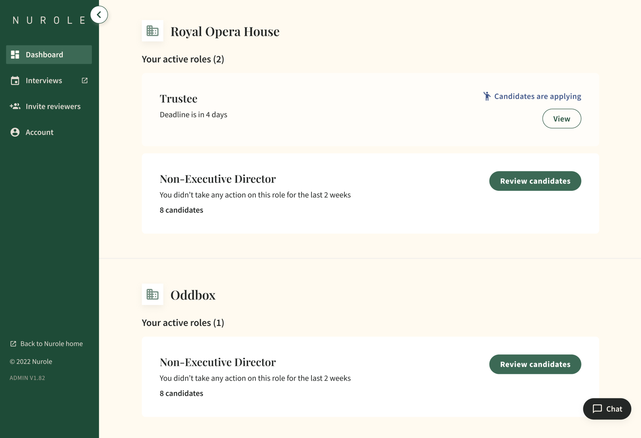
Nurole | B2B SaaS ToolA platform dedicated to Nurole’s clients in order to review candidates, sift them and organise interview rounds.
Final result
Final result
The problem space
After listening carefully to our client users and our fellow Nurolers, we identified a lot of pain points with our assessment tooling.
ArchitectureFirst, the tooling is embedded in our admin, therefore it is very slow, loads our full database every time, and has an overly complex navigation with a lot of irrelevant items for our clients.
UsabilityThere is no consistency with the rest of our tools, no clear signposting of where the user is, no easy way to navigate from the client journey to the member journey or even to News and Guides.
DesignAt that point I had reworked a lot of our tools and created a fully digital universe and colour palette, but that was only visible on the member journey. It was now time to update this interface as well!
Discovery journey
-

Ask the experts
I started interviewing all the experts (10) at Nurole across functions and teams (BD, CS, Ops, etc.). The objective was to learn what the main pain points in their everyday work when managing roles and using that tool to sift candidates in order to create their long list. But we also spoke to a few clients (3) to observe them open the tool for the first time and get their feedback first hand.
-

Insights gathering
After having done the sessions I collected all feedback and categorised it in Notion. That allowed the team to be able to refer to any comment made either internally or externally. We also then prioritised feedback with the rest of the team to agree on next steps and which areas to focus on for the MVP.
-

User stories
We did a lot of pairing sessions including PMs, Devs and QA from my squad but we also involved senior stakeholders to make sure we agreed on the core needs for our users. We also needed to design for our 2 types of clients: single or multiple decision maker.
The tool before we worked on it
It was part of our admin tool, on the same repository. So the first task was to make it a separate service with a dedicated and simplified navigation.
Journeys & flows
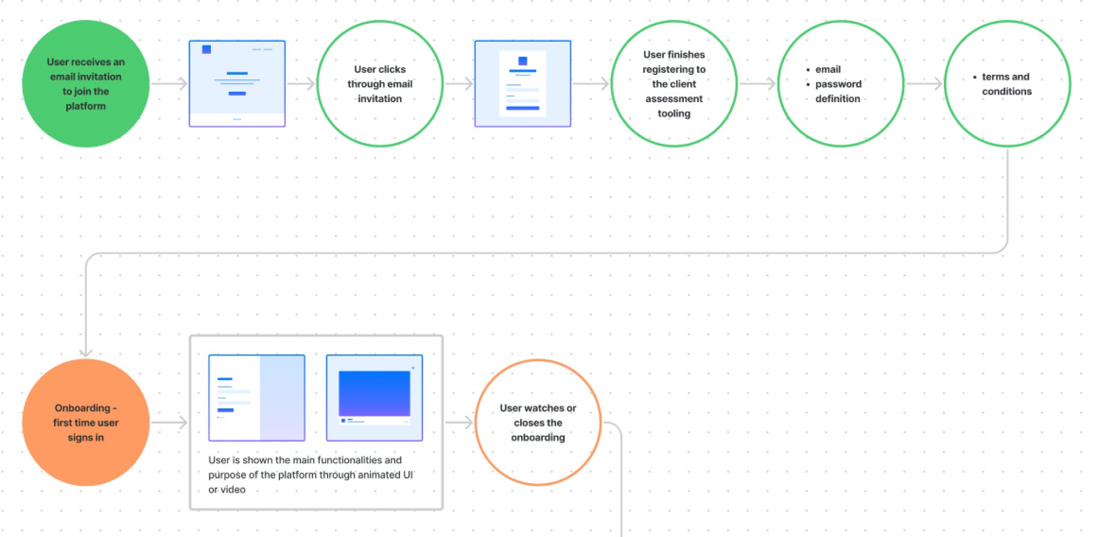
We worked on many iterations of the core journeys to clearly map the interactions and navigation within our tool. We also had to make the assessment tool work together with the meet tool in a smooth and logical way.
Wireframing
I paired a lot with the amigos (PM + Engineer) to ideate on many different ways to navigate and interact with the different features of that new tool
After that very detailed and documented discovery phase, we were able to start building the MVP confidently!
Prototyping, testing and iterating
-

Prototyping
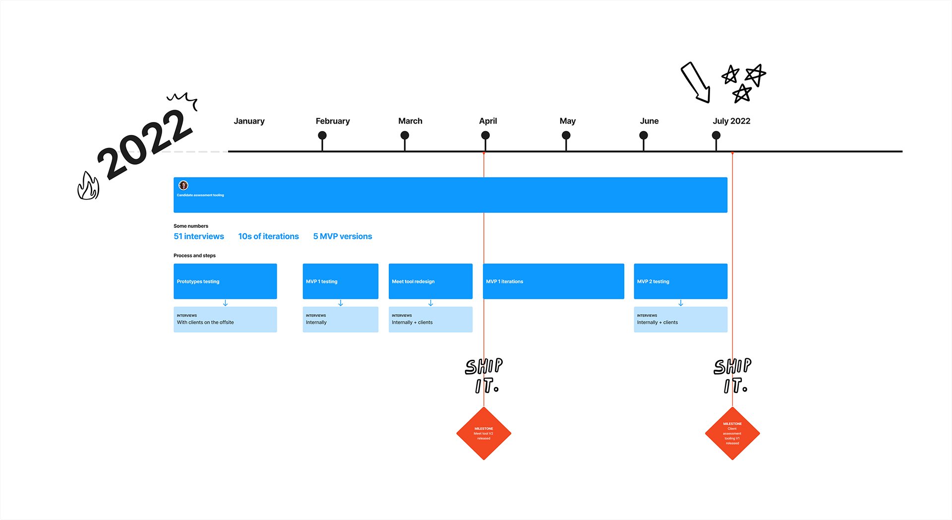
From December 2021 we paired with the team on specific functionality for the tooling. We had a few essential topics to discover and prototype one including: giving ratings, being able to comment with the board, test blind assessment functionality, etc.
To do so we had pairing afternoons where I worked on one topic with different devs and we shaped solutions together.
After having validated different concepts we all went to an offsite to build the designs and test them directly with clients. It was very efficient and fast paced but we learnt so much.
-

Minimal Viable Product
Having learnt a lot from our sessions with clients as well as our internal experts, we were finally ready to start building the MVP.
Now that we have identified and agreed on the most relevant functionality and fixed some interactions and journeys, we prioritised the most relevant components. We simplified the scope to the maximum efficiency to release the journeys incrementally and decided to start focusing on the making the list more engaging and easier to browse through.
We kept testing versions with our clients in order to get relevant feedback and keep iterating on the final version.
-

Meet tool
We are now full steam releasing more and more functionality to our MVP, scoping phases and prioritising with 3 amigos involved at every stage: PM, Developer and Designer.
The squad was finally able to work together on revamping and coupling the meet tool with the candidate assessment tool. That means that our clients were then able to organise interview rounds themselves without having Nurole to chip in. These were previously completely independent so it was great to be able to merge sifting and interviewing tools together for more efficiency and consistency in our Nurole ecosystem.

Here is the result of many months of discovery, iterations and collaboration within our Squad. You can see our Candidate assessment tooling as well as our Meet tool screens below.
Final designs

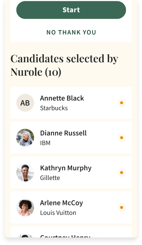


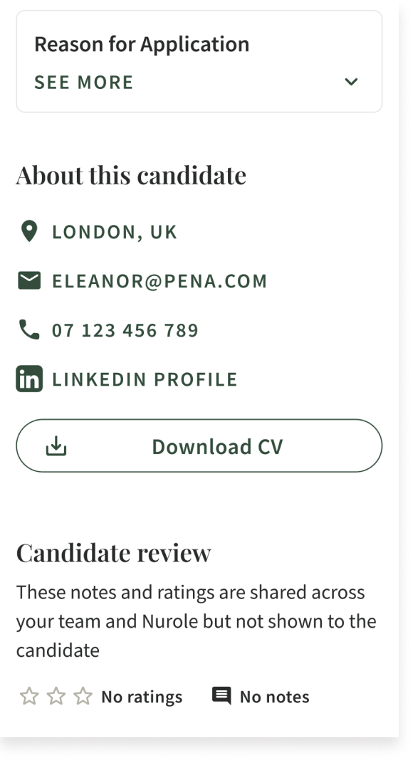


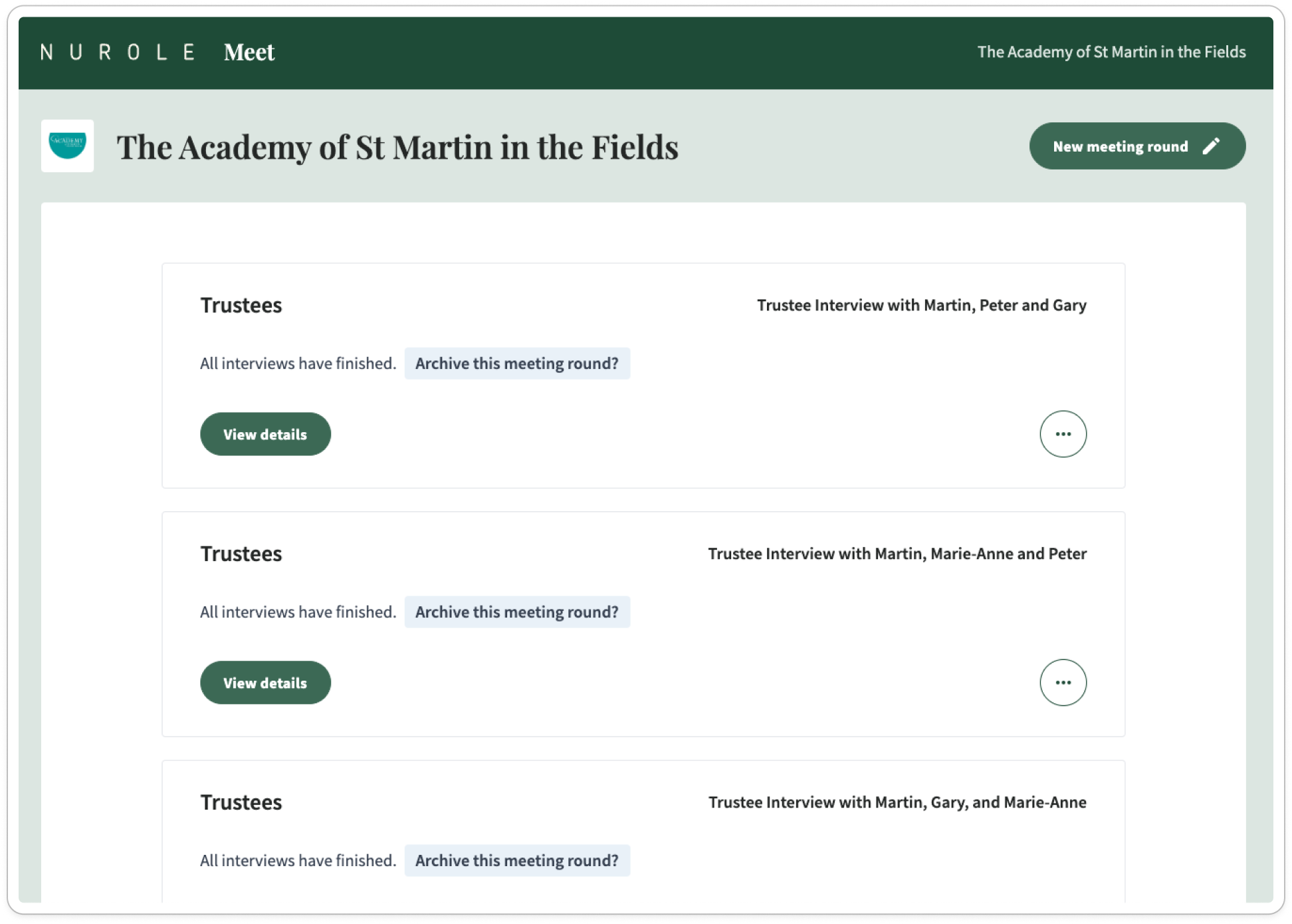


Data and insights
After 6months live, our data was already very encouraging and validated our rework of these tools.
Through that work, we significantly reduced the time spent per Customer Success person at Nurole. We also improved their headhunting time and efficiencies.
Summary of that project
Greenfield micro services and repository for both Assessment and Meet tools
Meet tool now used in all roles either by Nurolers or by our clients directly
We have driven adoption of client assessment tooling and noticed it through our very high Client CSat
